Fashion and colors - complete guide to using the clothing color wheel to match clothes and create a beautifully complemented outfit
You may have ignored it in junior high science class but in the fashion world, the color wheel is a game changer. Our minds see "beauty" as symmetry, balance, and repeated patterns. We naturally respond well to harmonious color combinations in clothing and accessories. If you understand how the fashion color wheel works, it will give you an entirely new perspective on color matching and ensure you have the tools available to create a perfectly balanced and classy-looking ensemble.
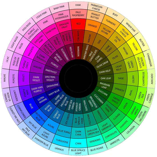
The fashion clothing color wheel

Primary colors

Secondary colors

Tertiary (intermediate) colors

Color temperatures
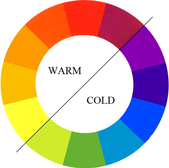
Another way to classify colors is by temperature. Warm colors are hues from red through yellow. Cool colors are hues from green through violet. Neutral colors are "colorless" and include black, gray, white, brown, and other colors in between. Warm colors appear more active and tend to arouse or stimulate the viewer while cool colors tend to recede and serve to calm and relax.
- Warm colors – yellowish white through red colors such as red, orange, yellow, and brown.
- Cool colors – bluish-white colors such as blue, purple, and green.
- Neutral colors – such as black, gray, white, off-white, brown, charcoal, and beige.
How to match colors and create the perfect color combination in your outfit
 Given the understanding of the color wheel for clothes and color temperatures, we can easily match colors that are pleasing to the eye and create a beautifully matched outfit.
Complementary colors
 Complementary colors on the color wheel
Complementary colors are colors on opposite sides of the clothing color wheel, For instance, red/green, yellow/purple, and blue/orange. Complementary colors always match.
Usually, the colors are the same distance from the center of the color wheel (i.e. shades), but you can play around with complementary colors at various distances from the center to produce a similarly satisfying combination. A trick professional designers use is to pick two complementary colors, then select one that is a slightly darker shade. For instance, instead of red/green, opt for red and olive green for variety while retaining a harmonious color combination.
Analogous colors
 Analogous colors (yellows in this example)
Analogous colors (also called dominance harmony) are colors that are continuous shades on the clothing color wheel. Different shades of the same color almost always look great together giving us another way to produce matching (i.e. pleasing) color combinations. Red, reddish-orange, orange, and yellow-orange are examples of a set of analogous colors.
Triadic colors

Split complement colors
Split complement colors are also pleasing to the eye. To find the split complement colors on the fashion color wheel, start with a color, then find the two colors next to its complementary color (the color on the opposite side of the wheel). Surprisingly, these colors often provide a pleasing balance of color. For example, using the wheel below we can see that the complementary color for red is green. The two adjacent colors, yellow/green and blue/green, also work well in an outfit that is predominantly red. As you can see in the dress below, the colors indeed work well together. Split complementary color schemes
Tetradic colors
Tetradic colors, also called double complementary, are the richest of all color schemes but the most difficult to harmonize properly. A tetradic color scheme requires one color to dominate over the others. Tetradic colors can be uncovered by looking for a rectangle of colors on the clothing color wheel. Similarly, a square color scheme uses four colors spaced evenly around the color circle. Again, pleasant tetradic color schemes are difficult to form but are sometimes found in professionally designed patterns.Other considerations
 There are a few other considerations to keep in mind when matching colors in an outfit.
13 comments
I have pale ( reddish undertones) skin. As I dyed my hair black, I looked great in jewel tones. … very saturated, bright, purplish blues, brighter greens , cool teal, cool true white black, grey and cool saturated reds. Now I am 74 and my hair is white in front and taupe in back (cool brownish grey). The hair in front is a slightly warm white (yellow undertones) cool taupe cool gray brown ) in the back. So now the jewel tones overpower me. I can’t seem to choose colors successfully for my changed features. Btw, my eyes are dark blue ( on the gray side. Can you please make suggestions and advise me?
Finally a deeper explanation of color wheel relationships. Thank you!
Very insightful fashion advice, I will use this guide a lot more in the
So excited to use your color wheels! Is there a way to get hard copies of each color wheel?
Outstanding, very helpful article.